Saturday, 26 September 2015

analysis of magazine/front cover


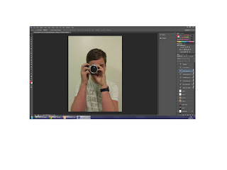
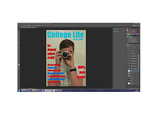
This is my first version I have changed a few things that I think has made my magazine look more professional. 
As you can see on my updated one I have made my cover story's line up with the masthead, I think this makes it look more professional.


Evaluation questions

what have you learnt from completing this task?
how hace you used technology?
what convextions have you used and why?
what would you change if you were to do it again?


contents page


analysis of mock up


Friday, 25 September 2015

Creating/designing product

First I added my main image to Photoshop that I took, this image will give the audience an idea of what the magazine is about so it was important that linked to main image to the main cover story. This is medium close up, this means that I had to hold the prop close to my face to get it in the frame. The medium close up was a good idea because it allows the audience to get get a close up picture of the image.

Next I made the masthead, this is important because it's normal the first thing that they look at at so it had to be eye catching, this is why i have made it light blue, Me and my friends think this bounces off the page and will want the reader to read more.

Next I have added the cover stories, these are also important because it informs the reader what is in the magazine. This is why I have decided after many attempts to do it blue and red to link in to the title and  they go together. One of the other designs that I did was yellow and blue, I thought this was good on my mock up however you couldn't see the yellow on the white background very well on my real magazine so I had to change it to red.

The last thing that I did was put the bar-code on, you need a bar-code on something you want to sell because it allows you to know how many magazines you've sold, this will let you know if your magazine is a success or a failure. If it doesn't sell well then you will know that you will need to improve the features.

Friday, 18 September 2015

Types of shot

long shot, this is were you get the full body in the picture

medium shot-this is were you get the torso in the picture

medium close up - this is were you get the upper part of the body

close up - this is were you pick a specific part of the object and focus on that

extreme close up - this is were you focus on a certain part of the object and zoom in

Thursday, 17 September 2015

front cover photos

Image result for blurred medium close up of person
I would not use this photo for my front cover because this image is blurred, this will take the focus away from the other things on my front cover like cover stories and masthead because people are more likely to focus on the negatives than the positives
I
Image result for wrong light medium close up of person
I would not use this photo for my front cover because this light is reflecting off his face. This will take the focus away from the other things on my front cover like cover stories and masthead because people are more likely to focus on the negatives than the positives

I would use this one, this is because it has a white background, good lighting, not blurry and there is know reflective surfaces. 
Image result for too dark medium close up of person
I would not use this photo for my front cover because you can not see anything properly This would make people not buy it because they would not be able see what the main article would be.

Feature story ideas

100% pass grades
Revision tips
Wyke football team got to the final!
Find out how the new students are settleing in
Find out who's dating who!
A chat with the teachers
A chat with the principal
Sign up to the after school sport teams!
Comments by you

Colour scheme

As you can see I have chosen the three colour pallets, this is so I can chose the best one. 

The first colour pallet is blue, red and yellow, if I were to use this one I would have red as the masthead and blue and yellow for the plugs/subheadings, I think this colour pallet will stand out against a dark background.
The second colour pallet is green, blue and red, if I was to use this one I would make the masthead blue, and the green and the red the subtitles/pug. I think this colour pallet will work best on a light background because of the dark colours.
The third colour pallet is blue, yellow and pink, if I was to put these colours in to my magazine I would use the pink as the masthead, and the blue and the yellow as the plug/subtitle. I think that this will work best on a dark background, this is because you wouldn't really be able to see the yellow or the blue in a light setting.

Magazine name

Student life
Hot news
The student
College life
Your news
Student voice
Wyke weekly
Campus life
Pow
CM (college magazine)


If I was going to pick the top three of these I would choose:

college life

Your news

Hot news

This is because I think that they are simple and can relate to the reader.

Mood board

Image result for photography studentsImage result for photography studentsImage result for photography studentsImage result for sport studentsImage result for students photoImage result for dance studentsImage result for studentsImage result for studentsImage result for studentsImage result for students

Analysis of college magazine front cover


Wednesday, 16 September 2015

Image analysis

Image analysis

When youy are taking an image their are three main elements and questions that you need to asked.

Where is the camera?
What choices has the photographer made?
What objects have been captured in the image?

I will now go on to use these in the 'trebor' advert.

The camera is pointing at a unicorn and a mint which is held in a posh looking hand on an infinate background.The first thing that your eyes see is the unicorns muzzle, this is useful because right next to it is the mint, this will make it one of the focal points of the image. In the image the viewer is positioned just below the level of the unicorn, this will make the unicorn seem bogger that normal which will link with the word 'discerning' from the slogan.

On the poster the photographer has used a white background, however I think that they have used this to make the audience think pruity, this is because the word pure is oftern asosiated with prue
ness and freshness which makes the audience that once you take the mint you will have freash breath and have a prue heart. White is also associated with luxury items, this will back up the theory that it is prue, also their is a black evening glove with posh jewelly that stands out against the white background, this improve the idea the idea that it is luxuries item from wealth and class.

LIIAR

Media studies key concepts

LIIAR

Language - what particular medium are you looking at? What is its particular terminology?

Institution - Who controls the production process and how does this affect the final product?

Ieology - what values are explict? And how does this affect the final product?

Audience - who is it for and what are they going to do with it? Will it fulfil its needs?

Represention - which groups/issues/individuals appear in it? How are they potrayed?What is excluded?

Monday, 14 September 2015

Brief

To design a College magazine front cover and mock up contents page. Images used on the front cover must be original.